
SetValue di un field con Column Formatting (SharePoint)
Tramite la proprietà customRowAction di Column formatting è possibile settare uno o più valori di un campo in un item SharePoint Online.
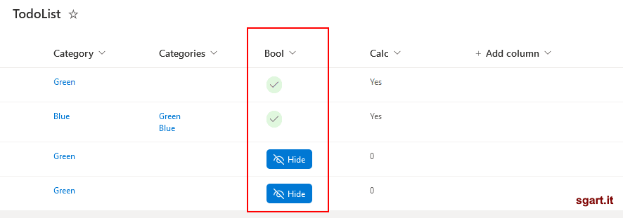
Può tornare utile, ad esempio in una check list, per impostare velocemente un flag.
description
Volendo si può spostare l'azione di setValue del campo (customRowAction) solo quando è visualizzato il pulsante:
Toggle On/Off
Può tornare utile, ad esempio in una check list, per impostare velocemente un flag.
customRowAction
Il formato è questoJSON
{
  "elmType": "div",
  "txtContent": "[$FieldName]",
  "customRowAction":{
    "action": "setValue",
    "actionInput": {
      "FieldInternalName_1": "FieldValue_1",
      "FieldInternalName_2": "FieldValue_2",
      "FieldInternalName_3": "=if([$Status] == 'Completed', 'yes', 'no')"
    }
  }
}
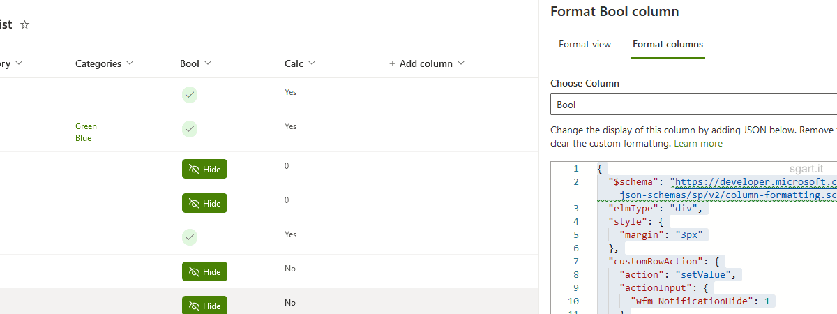
Esempio
Si può creare un Column formatting che visualizza un pulsate per settare il flag quando questo è false, mentre se true visualizza un iconaPower Automate: Button/Flag
{
  "$schema": "https://developer.microsoft.com/json-schemas/sp/v2/column-formatting.schema.json",
  "elmType": "div",
  "style": {
    "margin": "3px"
  },
  "customRowAction": {
    "action": "setValue",
    "actionInput": {
      "notificationHide": 1
    }
  },
  "children": [
    {
      "elmType": "span",
      "style": {
        "padding": "5px",
        "cursor": "pointer",
        "white-space": "nowrap",
        "border-radius": "20px",
        "display": "=if(@currentField == true, 'flex', 'none')",
        "align-items": "center"
      },
      "attributes": {
        "class": "sp-css-backgroundColor-successBackground",
        "iconName": "Accept"
      }
    },
    {
      "elmType": "div",
      "style": {
        "padding": "5px 10px 5px 10px",
        "cursor": "pointer",
        "white-space": "nowrap",
        "border-radius": "5px",
        "display": "=if(@currentField != true, 'flex', 'none')",
        "align-items": "center"
      },
      "attributes": {
        "class": "ms-bgColor-themePrimary ms-bgColor-themeTertiary--hover ms-fontColor-white"
      },
      "children": [
        {
          "elmType": "span",
          "style": {
            "font-size": "15px",
            "margin-right": "5px"
          },
          "attributes": {
            "iconName": "Hide"
          }
        },
        {
          "elmType": "span",
          "txtContent": "Hide"
        }
      ]
    }
  ]
}
Il bottone si adegua al tema del sito tramite l'uso delle classi CSS: sp-css-backgroundColor-successBackground, ms-bgColor-themePrimary, ecc....
Variante
L'esempio di prima rimane cliccabile anche quando il flag è settato, infatti ad ogni click verrà aggiornata la data di modifica (Modified) anche se il valore non cambia.Volendo si può spostare l'azione di setValue del campo (customRowAction) solo quando è visualizzato il pulsante:
Power Automate: Button/Flag non cliccabile
{
  "$schema": "https://developer.microsoft.com/json-schemas/sp/v2/column-formatting.schema.json",
  "elmType": "div",
  "style": {
    "margin": "3px"
  },
  "children": [
    {
      "elmType": "span",
      "style": {
        "padding": "5px",
        "cursor": "pointer",
        "white-space": "nowrap",
        "border-radius": "20px",
        "display": "=if(@currentField == true, 'flex', 'none')",
        "align-items": "center"
      },
      "attributes": {
        "class": "sp-css-backgroundColor-successBackground",
        "iconName": "Accept"
      }
    },
    {
      "elmType": "div",
      "customRowAction": {
        "action": "setValue",
        "actionInput": {
          "notificationHide": 1
        }
      },
      "style": {
        "padding": "5px 10px 5px 10px",
        "cursor": "pointer",
        "white-space": "nowrap",
        "border-radius": "5px",
        "display": "=if(@currentField != true, 'flex', 'none')",
        "align-items": "center"
      },
      "attributes": {
        "class": "ms-bgColor-themePrimary ms-bgColor-themeTertiary--hover ms-fontColor-white"
      },
      "children": [
        {
          "elmType": "span",
          "style": {
            "font-size": "15px",
            "margin-right": "5px"
          },
          "attributes": {
            "iconName": "Hide"
          }
        },
        {
          "elmType": "span",
          "txtContent": "Hide"
        }
      ]
    }
  ]
}
Toggle
In altri casi potrebbe servire un comportamento di tipo toggle, ovvero premo e imposto il valore a true lo premo un altra volta e lo imposto a false e così viaPower Automate: Button/Toggle
{
  "$schema": "https://developer.microsoft.com/json-schemas/sp/v2/column-formatting.schema.json",
  "elmType": "div",
  "customRowAction": {
    "action": "setValue",
    "actionInput": {
      "Toggle": "=if(@currentField == true, 0, 1)"
    }
  },
  "style": {
    "margin": "3px"
  },
  "children": [
    {
      "elmType": "div",
      "style": {
        "display": "flex",
        "padding": "5px 10px 5px 10px",
        "cursor": "pointer",
        "white-space": "nowrap",
        "border-radius": "5px",
        "align-items": "center"
      },
      "attributes": {
        "class": "=if(@currentField == true,, 'sp-field-severity--good','sp-field-severity--severeWarning')"
      },
      "children": [
        {
          "elmType": "span",
          "style": {
            "font-size": "15px",
            "margin-right": "5px"
          },
          "attributes": {
            "iconName": "=if(@currentField == true, 'Accept', 'Cancel')"
          }
        },
        {
          "elmType": "span",
          "txtContent": "=if(@currentField == true, 'On', 'Off')"
        }
      ]
    }
  ]
}
Power Automate: if
"Toggle": "=if(@currentField == true, 0, 1)"
Da notare che il confronto con il valore del campo è fatto con la keyword true, ma il valore va impostato con 0 e 1.